Chapter 2: User Interface - Part 2
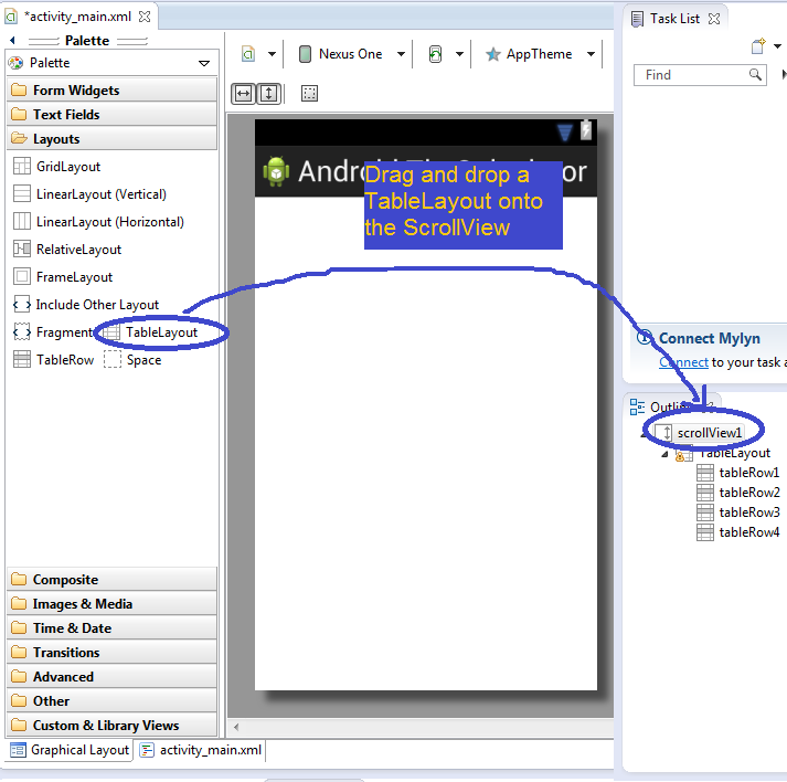
Notice that in the Outline window to the right, we can see the SrollView we just made. The Outline window gives us a summary of our UI elements. Now click Layouts under the Palette window. Then drag and drop a TableLayout onto the ScrollView we created in the Outline window. You can also drop it inside the ScrollView in the preview window. A TableLayout is a type of View that orients all the Views within it in a table.
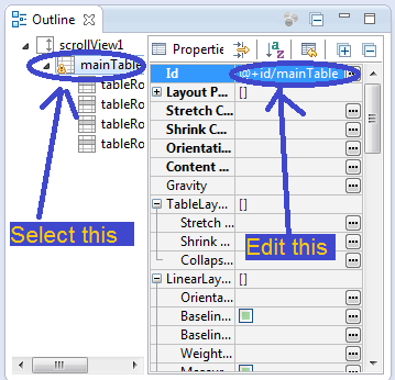
Now let's give the TableLayout an Id. By giving it an Id, we can reference this TableLayout later in our Java code. Select the TableLayout in the Outline, and on the right, you should see a bunch of the TableLayout's properties. Remember how I said objects have attributes? Well the Id is one of the TableLayout's attributes. Note that they call them properties here, which is another name for attributes. The TableLayout's properties can be set in this window. The first property is the Id. Change it so that the Id field reads @+id/mainTable. The format for Ids is always @+id/nameOfId. In other words, note that we need to put @+id in front of the Id we want to use.
Next, click on Form Widgets in the Palette window. Then drag and drop a Medium Text TextView onto the first row of mainTable in the Outline window. A TextView is a View that is a box of text. A Medium Text object is a medium-sized TextView. As you can see, the developers of Android have stupendous imaginations when it comes to naming their Views. Let's change some properties of this TextView. Change the Text property to Pre-Tax Bill:. Eclipse will likely give you a warning telling you to use a string resource instead of hardcoding it. Ignore that. It's good advice in lots of situations, but we don't need to here. Then click on the + icon next to Layout Parameters. Now that you can see the Gravity property, let's edit it. Make it say right|center_vertical. Gravity refers to alignment, in word processing terms. We just said to make this TextView right-aligned, as well as centered vertically. However, you'll notice that nothing happened in the preview window. Don't worry, that's normal. The changes will take visible effect when we add more stuff.
Now click Images && Media from the Palette window. Drag and drop an ImageButton onto the first row of mainTable. A Resouce Chooser window will pop up. Just hit OK for now. The ImageButton will now appear next to the TextView we made earlier, with a default image. As you may have guessed, an ImageButton is a View that is a button with an image on it. This button will be what the user presses when he's dining with friends and wants to add them to the calculations. Let's edit the ImageButton's properties. Give it an Id of addDinerButton, keeping in mind the necessary prefix we talked about before. We should also change the picture. To do that, you need to go find a picture for this button.
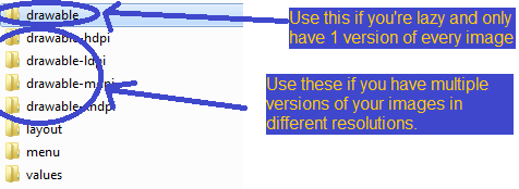
Actually, it's a little more complicated than that. You see, there are lots of Android phones out there. These phones tend to have a variety of resolutions. So to handle all these possible devices, Android lets you include up to 4 different versions of any given image resource you use. These go in the folders drawable-ldpi, drawable-mdpi, drawable-hdpi, drawable-xhdpi. You can find these folders in the res directory of your project (they're created automagically by Eclipse).
DPI is a measure of resolution, and stands for dots per inch. The prefixes presumably stand for low, medium, high, and extra-high. So if you have the patience, go ahead and find 4 different versions of an image, each of different resolutions, and put them in the appropriate folder. Make sure they all have the same name. Alternatively, download the source for this project and use my images. FYI, Google's suggested size ratio for ldpi:mdpi:hdpi:xhdpi is 0.75:1.0:1.5:2.0, or 36:48:72:96. See more information about multiple screen support here. Note that if you ever don't feel like having 4 separate versions for each image you want to use, you can just create a drawable folder in the res folder, and put one image there. Android will automatically resize the image based on what device your app is running on. There will be some quality loss from automatic resizing, but if you're lazy, you might just not care.
Right then, now that you have the image, we can set the ImageButton's Src property. As you may have guessed, Src stands for source. What you set Src to depends on what you named the image. I named mine adddiner.png, so I have to set Src to @drawable/adddiner. Note that I don't have to specify a particular drawable folder. Android will automagically look for the correct resolution folder. Also note that we don't put the file extension. And again, remember to make all the different versions of your image have the same name. Make sure to put the @ symbol in front of drawable. The preview should now show the updated image on our addDinerButton. If not, right-click your project in the Package Explorer and click Refresh.
At this point, you may notice Eclipse warning you to use the contentDescription attribute on addDinerButton. You can ignore this if you want. I believe contentDescription is an accessibility option, to help with people who are visually-impaired. Up to you.
Let's make another row. Click Text Fields from the Palette window. Drag and drop a Person Name EditText onto row 2 of mainTable. An EditText is kind of like a TextView the user can edit. Give this EditText an Id of firstCustomer, a Text of Customer, and a Gravity of center. Now scroll down the properties list and find the properties under TextView. Under TextView, find the Gravity property. Note that this is a different Gravity property than the one in Layout Parameters, which we set to center. Views in Android tend to have 2 Gravity properties. You can play around with them to see what the difference is. You can also hover over a property, and Eclipse should tell you what it does. Or, refer to this handy-dandy infographic.
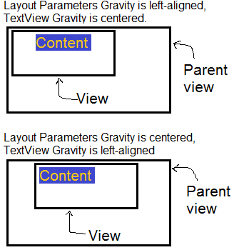
Essentially, the Layout Parameters Gravity, henceforth known as layout gravity, controls how a View itself is aligned, and, for TextViews, the TextView Gravity, henceforth known as gravity, controls how the text is aligned within the View. Note that the layout gravity is layout_gravity in XML, while the gravity is just gravity.
So, set the gravity (not the layout gravity) to right|center_vertical. After that, still under TextView, find the property called Select All On Focus. Set this to true by clicking on the checkbox. This means that when the user clicks on this EditText, all the text currently inside it will be selected. Focus refers to what View is currently active. This makes it easier for him to edit firstCustomer, since as soon as he starts typing, it will delete what was previously there (because it was automatically highlighted).
Next, drag and drop a Number (Decimal) EditText onto row 2 of mainTable. Change the Id to amount1of1, Text to $0.00, layout gravity to center, gravity to center, and Select All On Focus to true. We're calling this EditText amount1of1 because it is the first order of the first diner.
Now we need a button that the user presses when he wants to add another order for a particular diner. So go find the appropriate image resources or use the ones I provided in the project source files. Then drag and drop an ImageButton (remember where that was?) onto row 2. Set the Id to addButton1, and set the Src based on what you named the image. For me, I had to set it to @drawable/additem. I know, I'm almost as creative as the guys who name the Android Views.
Glossary
Content Description: A View can have a content description. It's basically just a description of what the View is, in your own words. Those who are visually impaired rely primarily on audio cues to interact with your apps. Their devices can read (and vocalize) TextViews and the like quite easily, but things like ImageButtons can't be interpreted by their devices automatically. If you give a View a contentDescription, then their phone will read that description to the user when he wants to know what the View is. In short, it's for accessibility.
DPI: Dots per inch is a measure of resolution. A high DPI means for a given amount of physical space, there are a relatively high amount of pixels, or dots, in it.
EditText: An EditText is a View object that displays text that the user can usually manipulate. It's generally used to get information from the user. There are different versions that limit what kinds of characters the user can input.
Focus: A View has focus if it is the currently active View. For instance, if the user is editing an EditText, that EditText currently has focus. Hitting the Next button will give the next View focus.
Gravity: What I'm calling gravity refers to the alignment of the content within a View, which is different from layout gravity.
Id: An Id is something you can give your Views when you're designing your user interfaces. You can then refer to these Ids when you are coding your app in Java in order to access the Views you made with XML or the Graphical Layout tab. More on this in chapter 3.
ImageButton: An ImageButton is a View object that is a button with a picture on it.
Layout Gravity: What I'm calling layout gravity refers to the alignment of a View within its parent View, which is different from gravity.
Property: A property is just what Android programmers sometimes call an attribute. I use this term interchangeably with attribute.
TableLayout: A TableLayout is a View that arranges the elements inside of it into a table.
TextView: A TextView is a View object that displays text that the user cannot usually manipulate. It's probably one of the most common Views used in Android.